Rendering Agent Plans Into Something I Can Actually Review
Claude Code plan review falls apart in chat scrollback. Why I render every implementation plan as a browser page I can navigate, mark, and annotate.

A plan from Claude comes back as text. Useful text, mostly in the right order, but still a long Markdown document I'm supposed to read top to bottom in a chat window before I let an agent run with it.
For a short plan, that's fine. For a real one (a dozen-plus tasks, a dependency graph, a test inventory) reading it in chat stopped working for me. I'd lose my place. I couldn't trace the dependency ordering without scrolling up and down. So I'd skim, recognize the headings, tell myself it looked right, and approve it. The problems would surface later, during execution, the kind a real read would have caught.
The plan was never the issue. The way I was reading it was.
That's why I now render every non-trivial plan as a browser page before I review it. I think in visuals: it's far easier for me to map an architecture, and the folder hierarchy it's going to touch, when I can see it instead of scrolling past it. And I want to be able to leave a comment on one part of the plan, go do something else, come back, and still find my note sitting there.
I always plan, so the plan already exists
A bit of context on how I work. I plan before I build, every time. Not as a ceremony, but because a structured plan is the cheapest place to catch a bad decision. By the time it's code, the decision has cost you something. By the time it's in the plan, it costs you a sentence.
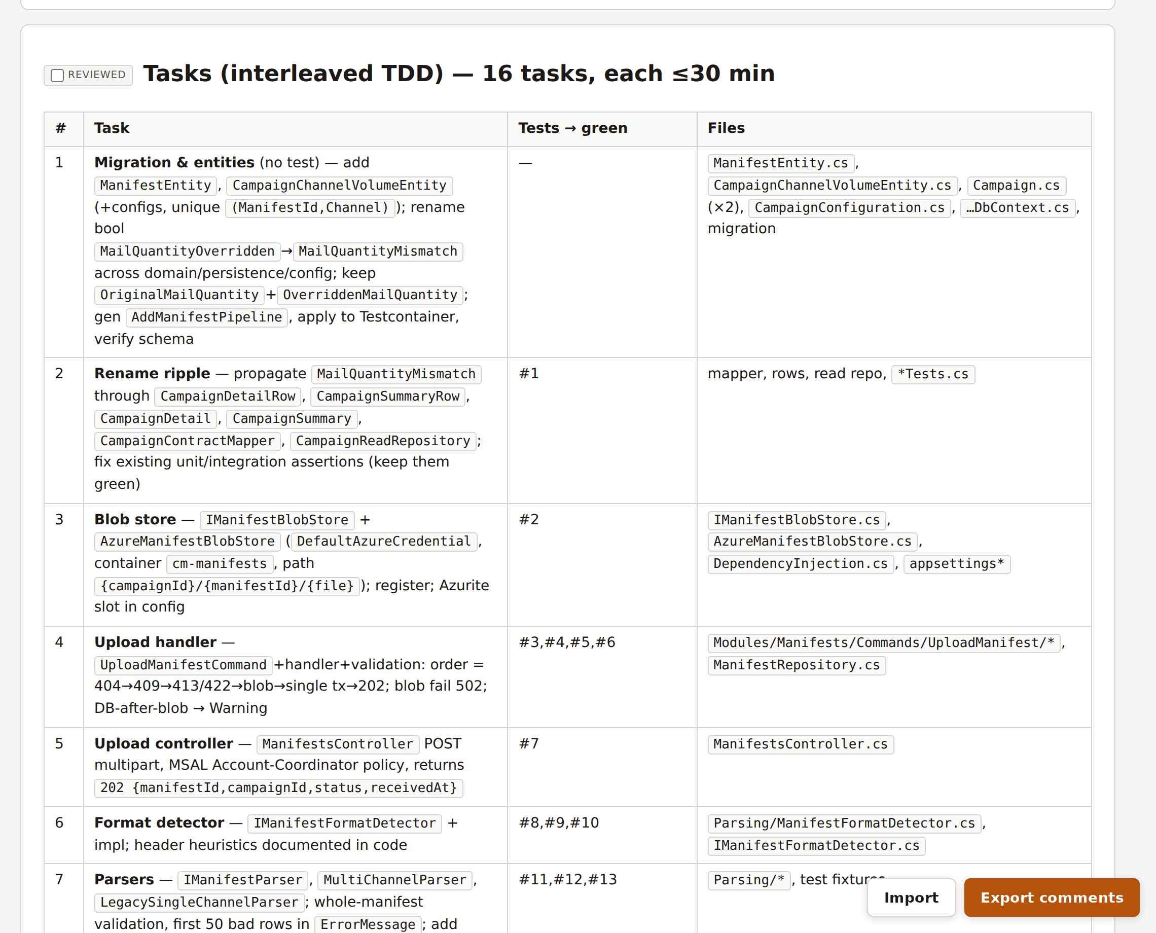
That means my plans are not throwaway chat output. They are deliberately specific and organized so I can find information fast: each task spells out what it depends on, the concrete files it changes, and the tests it owns, written before the implementation. There's a task table near the top and a separate test table at the bottom. It looks a lot like a Spec Kit task list or a small PR description, and that's on purpose.
I also already had a reviewer. My /review-plan skill fans a plan out to three independent sub-agents (a conventions auditor, a pragmatic engineer, a delivery lead) and gives me back one verdict. I wrote about that in a previous article. It's good at what it does.
But here's the thing the verdict night taught me: the reviewer gives me a verdict. It does not help me read the plan. Those are two different jobs. A second opinion tells you whether someone else thinks the plan is sound. It does not replace sitting down and actually reading the thing you're about to let an agent execute for the next hour. And the more I leaned on the verdict, the less I read.
A second opinion is not a substitute for reading the plan yourself.
Chat scrollback is hostile to a structured document
Once I started paying attention, the problem was obvious. All that structure I carefully put into the plan is wasted the moment it lands in a chat window.
Think about what a chat transcript gives you for reading a 600-line document:
- No table of contents. You navigate by scrolling and hoping.
- No collapsing. Every task is fully expanded all the time, so the dependency graph you care about is buried under design prose you've already read.
- Nowhere to take notes. If I want to flag "task 9 contradicts task 3," my only options are to hold it in my head or break my flow and type it into the same stream I'm trying to read.
- No memory of where I was. One context switch and I'm scrolling from the top again.
Anthropic's own writing on context engineering has a name for part of this: context rot. As a transcript grows, finding the signal in it gets harder, for the model and for me. A long plan buried in a longer conversation is precisely that failure mode. The plan deserves to be off to the side, as its own thing, not as the four-hundredth message in a scroll.
The official docs even admit this, quietly. Claude Code's plan mode lets you hit Ctrl+G to open the plan in your text editor "for direct editing before Claude proceeds." That's the escape hatch: the team knows the plan is an artifact you need to sit with, away from the chat. But a raw Markdown file in an editor still has no table of contents, no collapsible sections, and no place to leave a comment that survives the next edit. It's better than scrollback. It isn't enough.
What I needed was the exact inverse of that list: jump to any section, fold away what I'd already read, and pin a note where I left off. None of it is exotic. It's just review ergonomics that neither chat nor a text editor gives you.
The fix: render the plan as a page
So I added an html mode to the skill. It does one thing: take the plan Markdown and turn it into a static web page built for reading and annotating, then serve it locally.
Two small bundled scripts do the work. convert.py parses the plan and emits the HTML. serve.sh serves the folder on localhost. I run:
/review-plan html path/to/plan.md
and get back a URL. That's the whole interaction. No new app, no config.
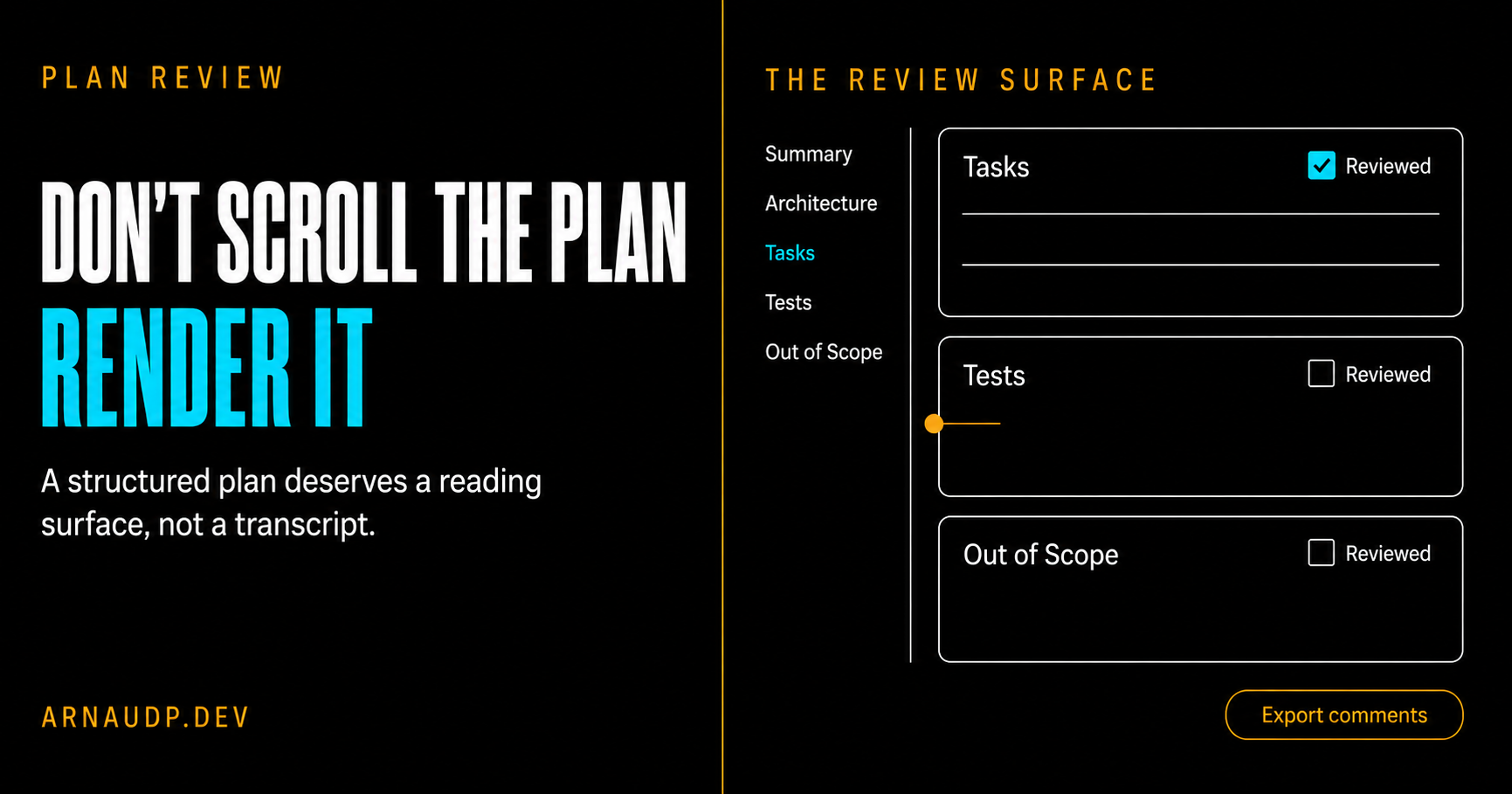
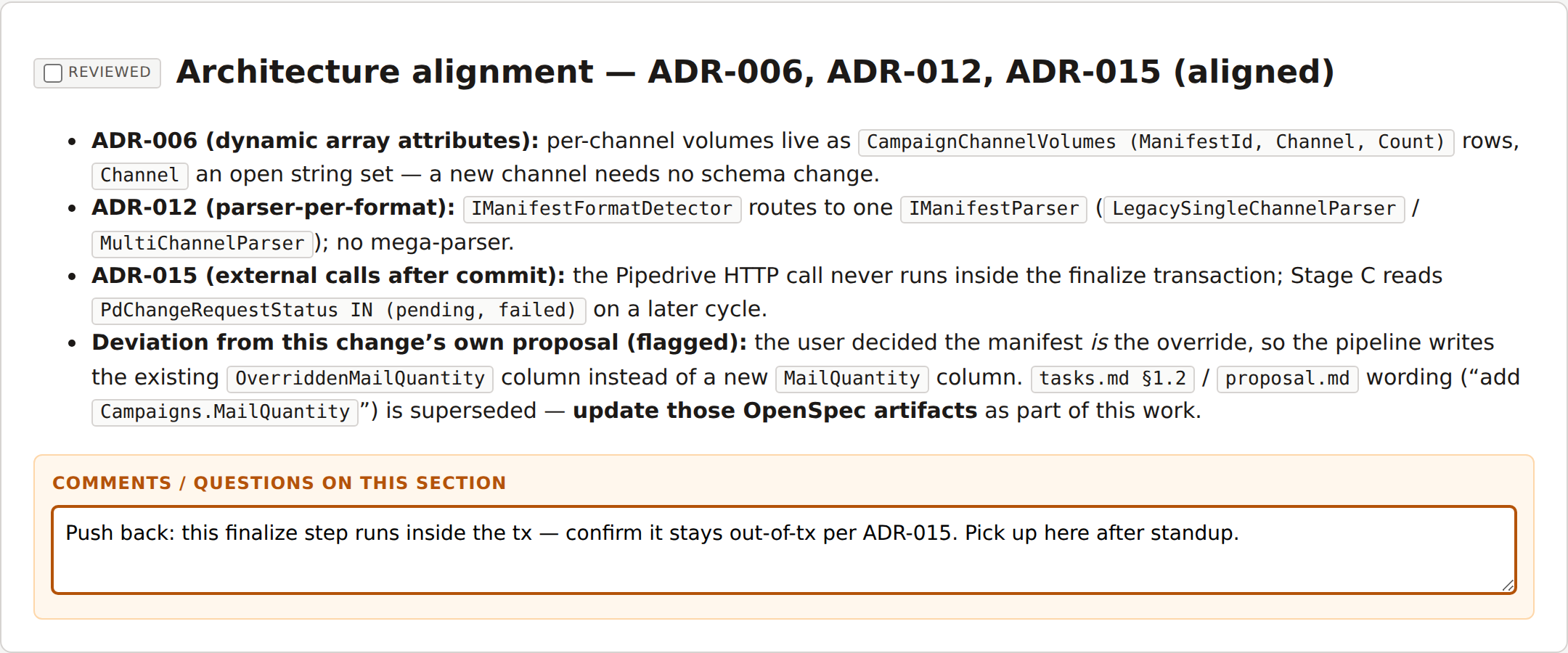
The page is built directly from the structure that's already in the plan. The converter splits the document on its section headings to build collapsible cards and a sidebar table of contents. Every section becomes its own card: the summary, the architecture notes, the diagram, the task table, the test table, the out-of-scope list. I didn't invent a new metadata format for this. The discipline I already keep in my plans is exactly what powers the UI.
Here's what it looks like.
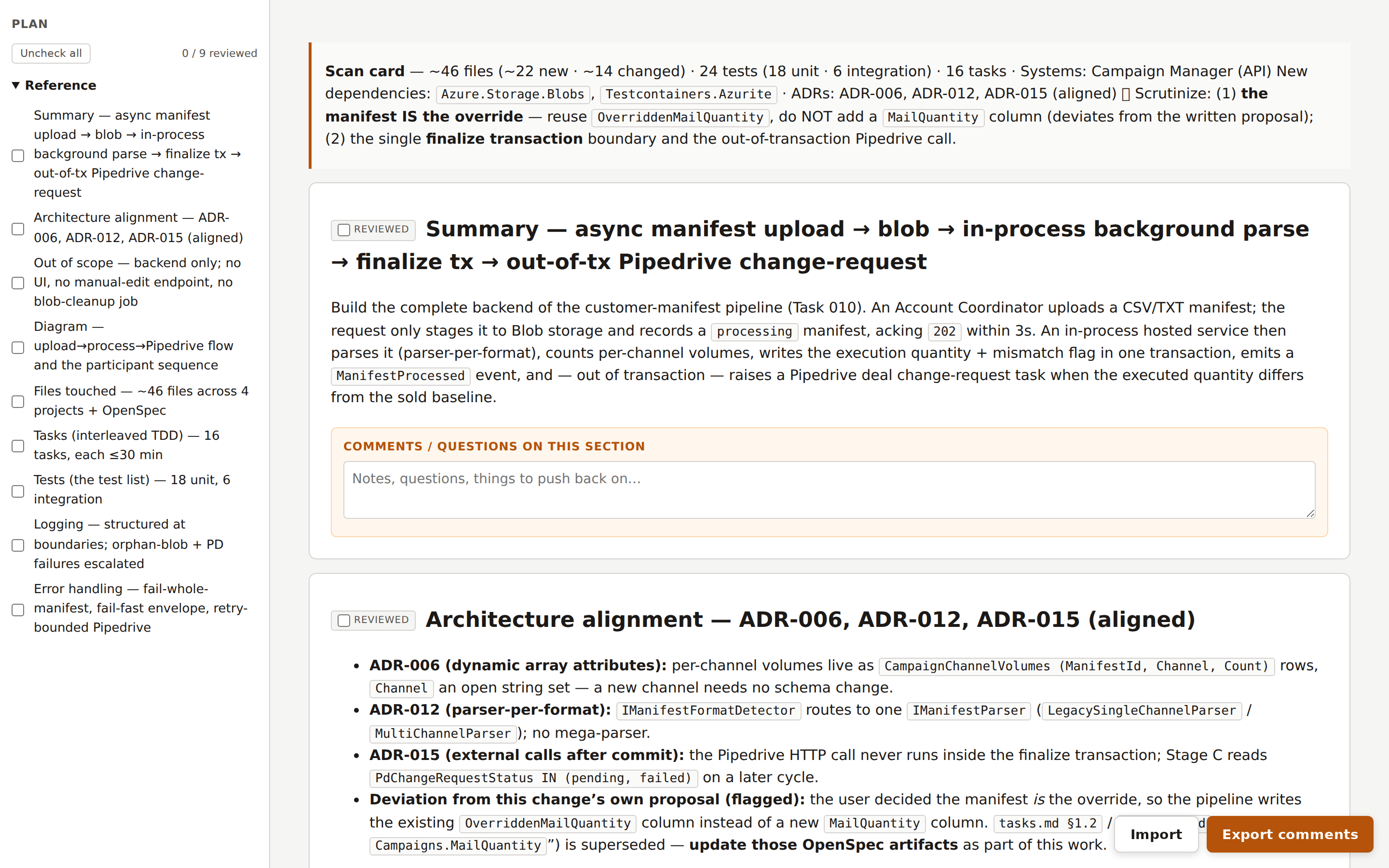
Sidebar on the left, one entry per section, so I can jump straight to the part I want without scrolling. Each card has a Reviewed checkbox, so the page remembers which sections I've already cleared. And there's a comment box under every section.
You might ask why I didn't just point an existing Markdown viewer at the file. I do, sometimes, when I only need a quick read. But a plain Markdown render gives you a nicer-looking document and stops there. No collapsing, no jump-to-section, no Reviewed state, nowhere to leave a note that's still there when you come back. None of the rich, interactive parts I actually wanted for a review, and no idea where one section ends and the next begins. This page is generated from the plan's own structure instead: every section becomes a card I can collapse and mark as reviewed, and the task table and test table render as real tables I can scan. And it closes the loop the other way too. My exported notes come back grouped by section, in the same Markdown the agent already reads, so they drop straight into the next round of edits. An off-the-shelf viewer gives me a nicer place to read. It doesn't turn my reading into something the agent can act on. That round trip is the point, and it's the difference between this and a Markdown viewer with extra steps.
What actually changed for me
Three things got better, and they map exactly to why I was frustrated.
I can see flow and dependencies
I think visually. A dependency graph rendered as a Mermaid diagram tells me in one glance what a list of "Depends-on: T-003, T-007" lines never will. In the page, diagrams render inline as real diagrams instead of collapsing into a wall of indented text the way they do in a fast scroll.
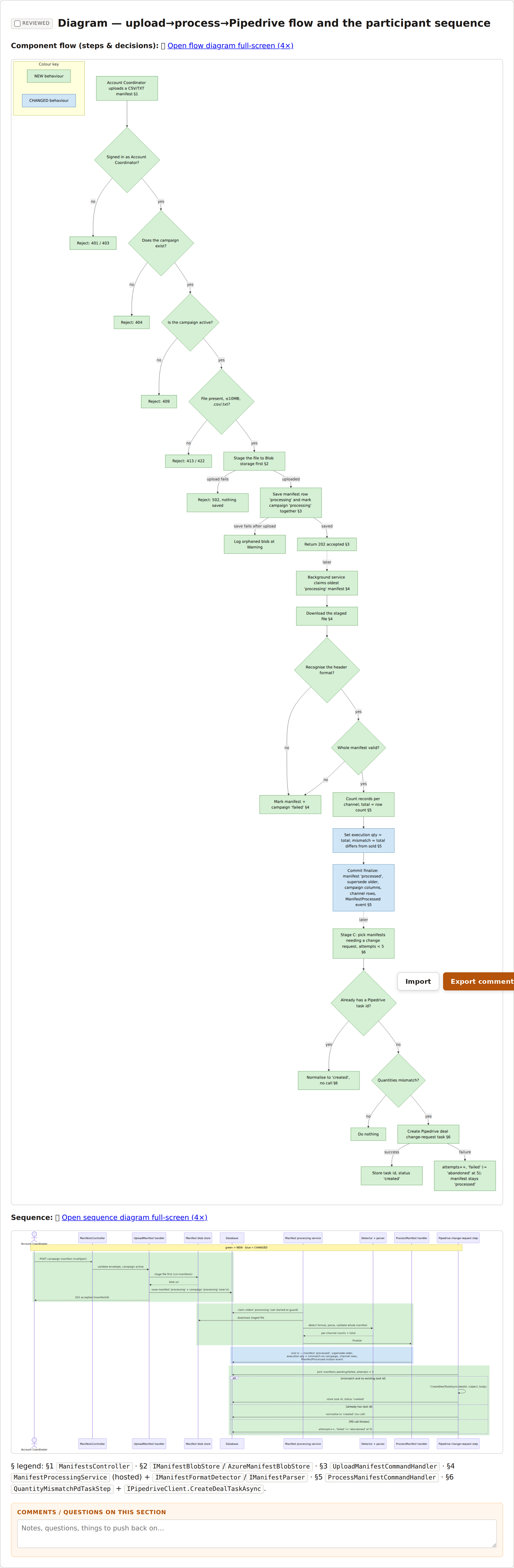
When I'm checking task ordering, this is the view I live in. I can follow an edge instead of reconstructing it in my head from ID references scattered across the document.
I can find anything in a second
Because the plan is structured and the page honors that structure, the task table is right there: every task, the tests it turns green, and the files each one touches. That last column is the one I care about most. I like to see the hierarchy of folders a change is going to touch before it happens, and here it's a column I can scan, not a detail buried three paragraphs into a task I have to find first.
I can annotate without losing my place
This is the one I underrated. Every section has a comment box. When I spot something, I type a note right there, against that task, and keep reading. I don't break flow to switch windows. And because the note lives on the section, when I get pulled away and come back twenty minutes later, my own comments tell me exactly where I was and what I was thinking.
That last point is the multitasking fix. Losing my place was never about discipline. It was that the medium had no way to hold my place for me. Annotations do.
The one design decision I'm opinionated about: no backend
When you say "comments on a document," people reach for a database. Accounts, a server, a sync layer. I deliberately built none of that.
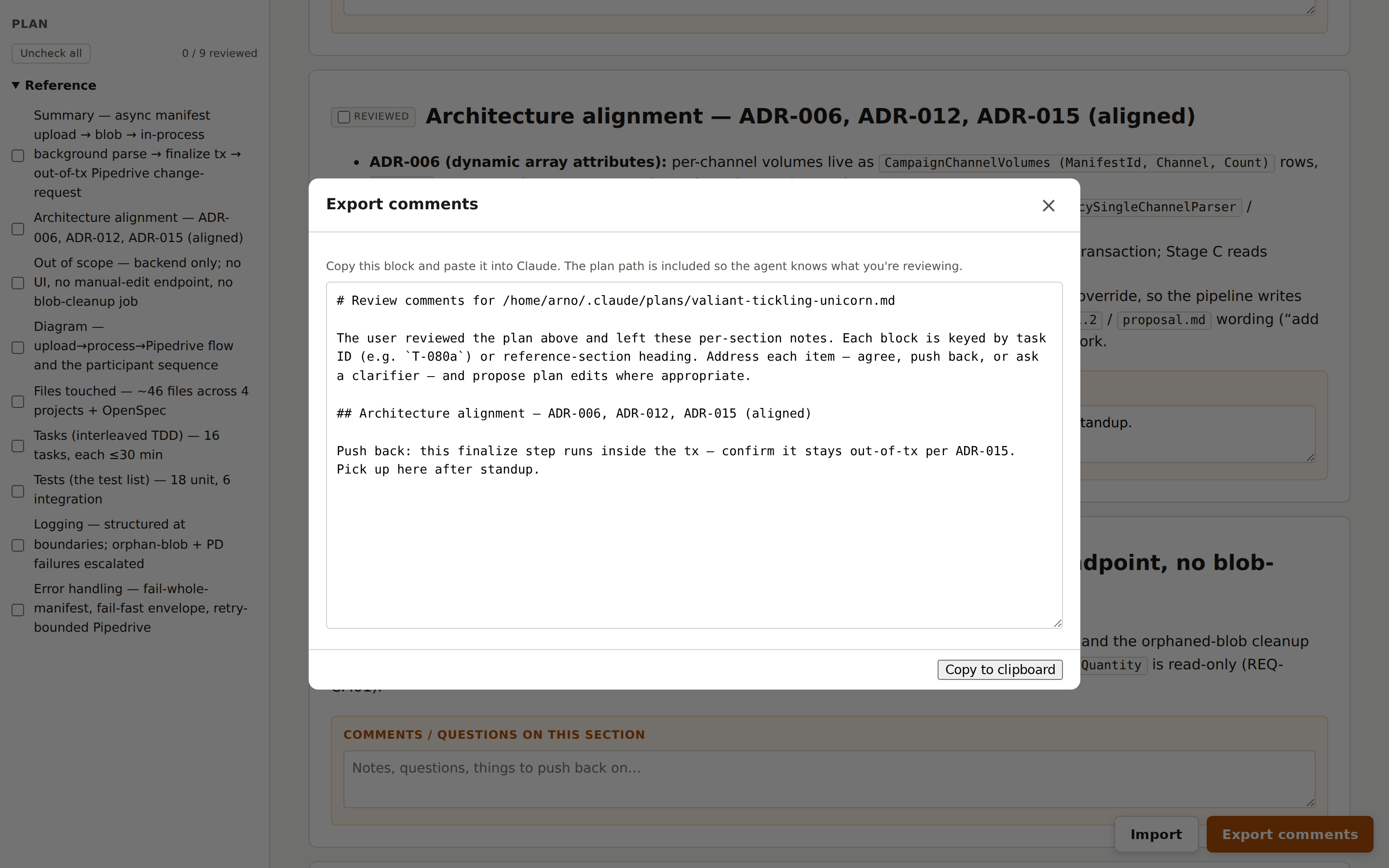
Comments live in your browser's localStorage, keyed by the plan's path. There is no server-side state, no account, nothing to deploy. When I'm done, I hit Export comments and get a single Markdown block, every note grouped under its section heading.
I copy that block, paste it back into the chat, and it becomes the input to the next round of plan edits. That's the whole loop: read in the browser, annotate in place, export, paste, revise.
This is a deliberate KISS choice. It's a local, single-reviewer tool that binds to 127.0.0.1 only; on a remote box I forward the port over SSH. Pretending it was anything more would mean a database I don't need and a server I'd have to secure. The export-and-paste step makes the notes durable; everything else stays disposable, which is exactly right for a page I regenerate on every plan.
And the cost of using it is zero, because I was always going to write the plan anyway. The plan already exists in the right shape. Turning it into a page is one command. There is no reason not to.
What I'd tell my past self
Two habits I had backwards for longer than I'd like to admit.
Don't let the verdict stand in for the read. It's tempting, especially when a reviewer hands you a confident green light. But the docs warn about this from the other direction too: a reviewer told to hunt for gaps will always find some, and chasing every flag leads you straight into over-engineering. The verdict is a signal, not a decision. You still have to read the plan and make the call. A good reading surface is what makes that something you'll actually do, instead of something you mean to do.
Structure the plan so it can be read. A plan that comes out as a prose blob can't be navigated, can't be collapsed, and can't be annotated section by section. There's nothing to render, because there's no structure to honor. The same discipline that makes a plan good for an agent to execute (clear sections, explicit dependencies, a test inventory) is what makes it good for a human to review. Write plans like documents, not transcripts.
I review every non-trivial plan in the browser now. The same plan that used to be a wall of text I'd skim is a page I move through on purpose: the ordering shows up in the diagram, the files each task touches sit in the table, and my own comments mark where I left off. I read it now because the page makes reading it easy. The plan was never the problem. The surface was.
If you keep your plans structured, the surface is one command away. The next time a long plan lands, don't scroll it. Render it, and actually read it.